
The Myth of Index Investing
It's easy to beat the benchmark

Investing gurus present index investing as a data-driven approach to the market that outperforms other methods, especially professionally managed funds. However, even taking this advice at face value, if, like me, you have the mind of a skeptic, you may start asking questions. Why does everybody invest in the top 500 companies? Is it an optimal number? Does market cap weighting really produce better results?
Those were mine, and I promise some juicy answers. They will likely surprise you, and maybe even change the way you invest. Why? Because you’ll learn easily replicable ways to beat the famous S&P 500 benchmark. Despite what experts say, it’s actually quite easy, and here is why:

The Cult of 500
Economics is a social science, and even though it likes using charts and numbers, it belongs to the same category as psychology and history—not math. It studies human behaviors, and what is considered “truth” relies more on beliefs than math formulas. I bet you’ve heard that “2% inflation is good for the economy” maybe even repeated by a central banker or a Nobel Prize winner. Not a single study backs it up. Yep. It’s completely made up. That’s an important introduction because while questioning common math or physics claims is usually silly, you don’t have to be shy to question popular economic beliefs. Many of them are just opinions.
On the surface, index investing seems to have more substance. It relies on the idea of diversification, which is likely as old as civilization, if not older, and which most people rightfully accept as common sense. However, even if we believe in the benefit of diversification, both the criteria and the ideal number of stocks in a portfolio remain in question while popular indexes are quite specific.
Important: All the following charts in this article show dollar-cost averaging simulations, which is a more relevant context for long-term investing. I decided to stick to DCA as a reference for consistency across the charts.
How Many Stocks is Enough?
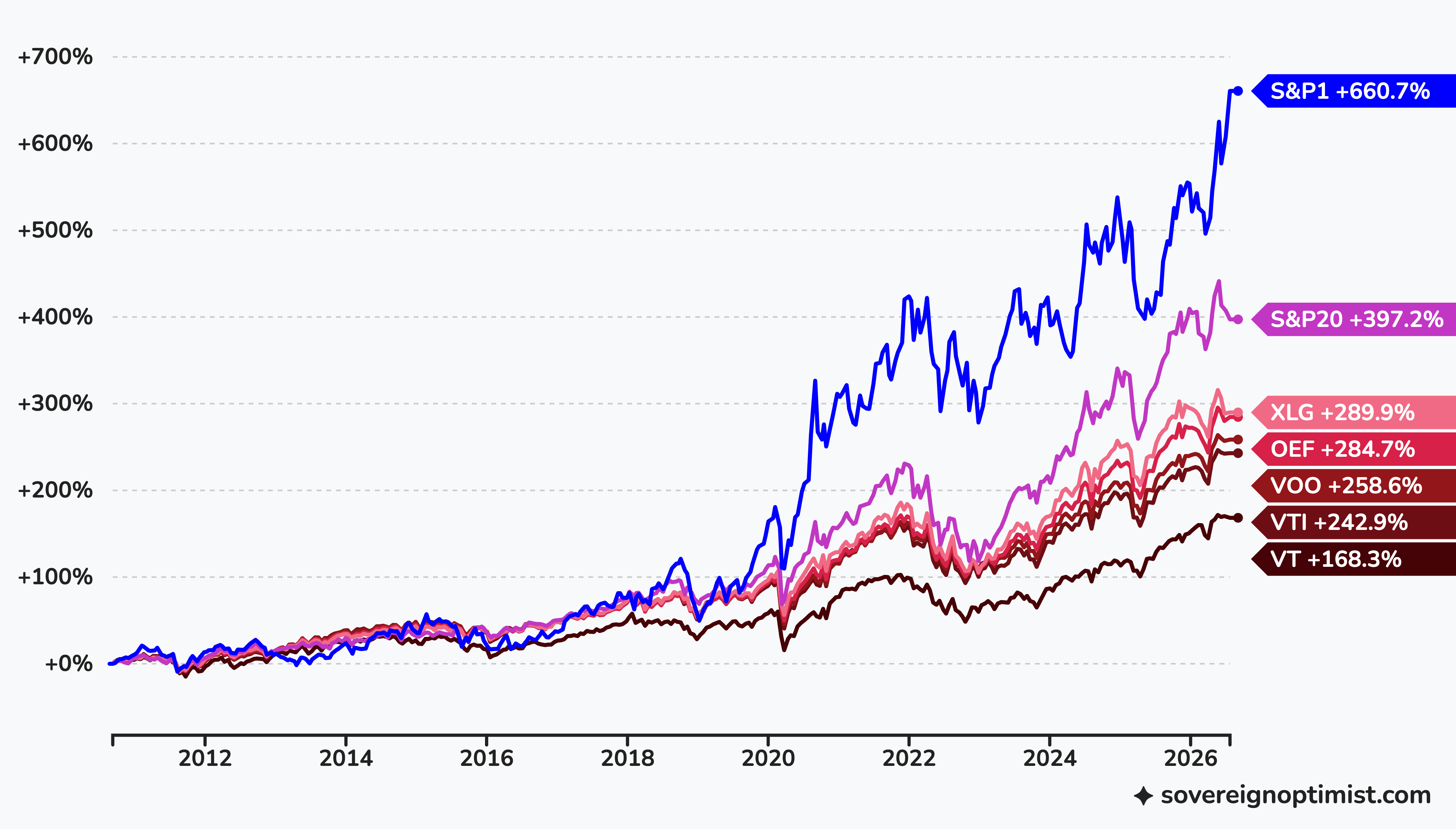
VOO 0.00%↑ tracks the S&P 500, VTI 0.00%↑ expands it to ~3,500 US stocks, while VT 0.00%↑ adds ~6,500 of the world's stocks on top. As the chart shows, in this case more diversification is not better—in fact, it's the opposite:
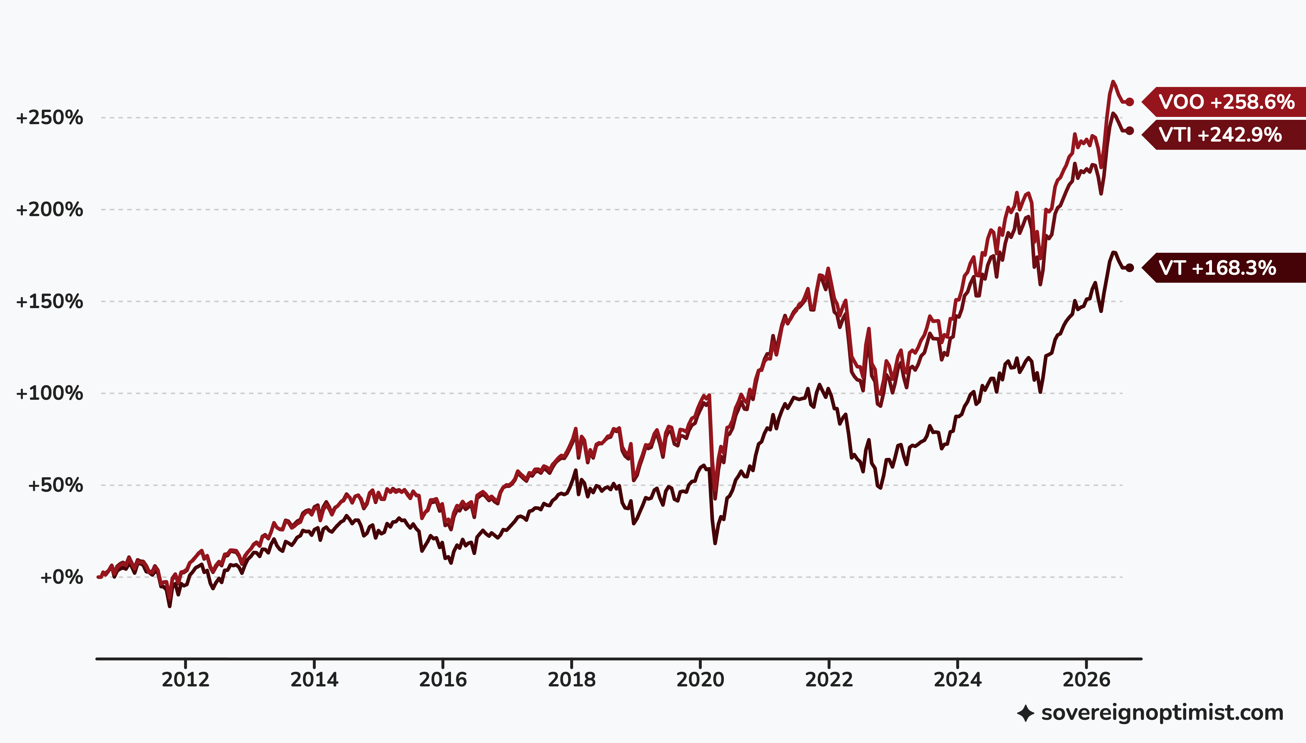
So far, it looks like the S&P 500 is the right choice. But the story doesn’t end here. Can we reduce the number of stocks further? What about the top 100 or even top 50 stocks? Will it further improve the outcome? We’re in luck because such ETFs exist with enough history to compare. OEF 0.00%↑ tracks the top 100 stocks in the S&P index, while XLG 0.00%↑ tracks the top 50, and yes, the benefits continue:
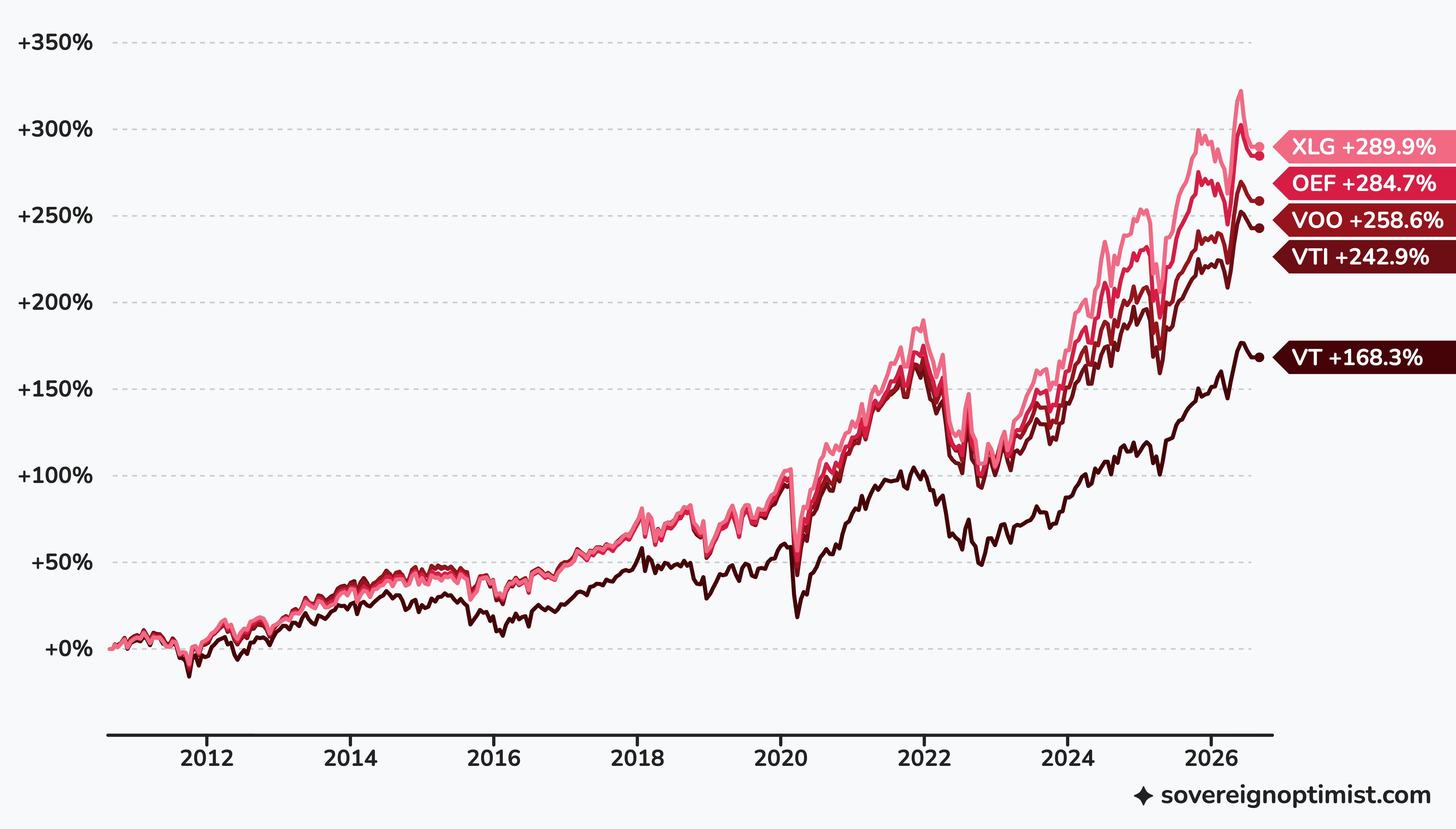
At this point, a natural question is: ok, so is it 50? What is the optimal number?
What if I told you that dollar-cost averaging into just one—yes, you heard correctly: one—the biggest company on the market (whatever it is at the moment) outperforms any market-cap-weighted ETF based on the S&P index by a huge margin.
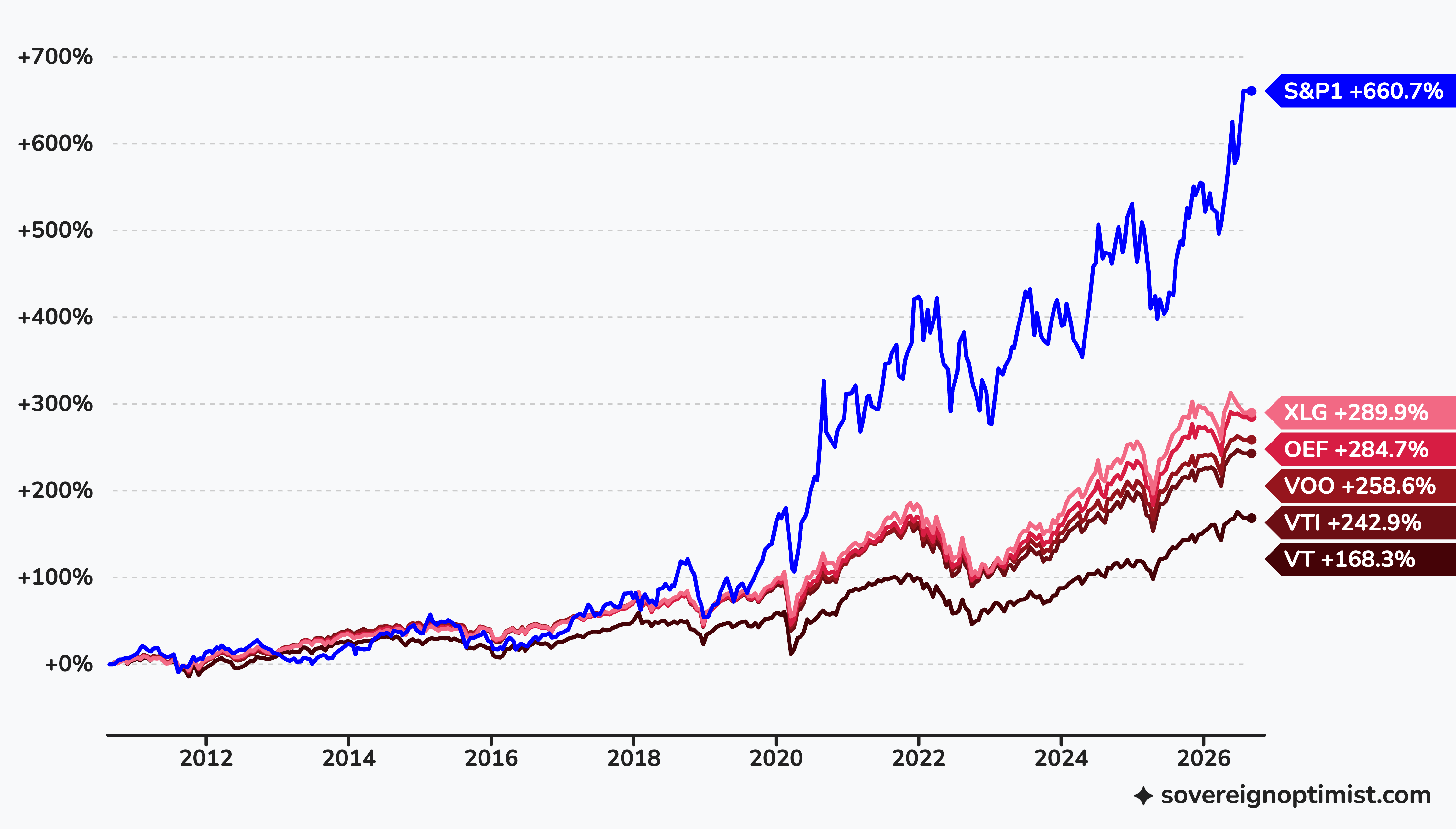
This is a slightly different strategy, not exactly “the index of one,” because it means never selling. Including rebalancing for just one asset creates churn and taxes that make it ridiculous. “Buy and hold" is a close-enough version, equally easy to implement and useful for the moment. We’ll explore this direction later.
The Index Way
So far we've tested these strategies from 2010 onward because the explosion of ETFs happened relatively recently, and many don't have a longer history. You may argue that this is not enough data to question the strategy. In the upcoming Part II, we’ll simulate it further back, but what we see on the charts above is not seasonal, but structural.
Market cap weighting—which is the dominant way popular indexes are built—by definition puts money into companies winning on the market. The bigger the company, the bigger the allocation. You can easily check that indexes tracking 50, 100, and 500 stocks share most of their allocation, and the top holdings are just… top performers.
Now here is the second, ugly part: The fact that we started treating index investing as a free ride for decades has consequences. If investing in market winners is your thesis, and everybody else does the same, it only makes sense to beyond the top few companies in the index, and the newest ETFs doing exactly that only prove the point.
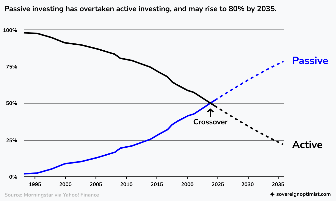
The chart above is essential because it explains why backtesting far back in time doesn't necessary make sense. Index investing structurally changed how the market works, and this transition happened in the last twenty years.
Today the top 20 stocks in the index are already 50% of the total S&P 500 allocation. There is nothing strange in the fact that they perform better when most of the investors on the market allocate capital through index funds that favor companies with large market caps.
It’s true that some of the small and mid caps in the index turn out to be very successful over time, but because the allocation is weighted, you invest too little into them for it to matter. What you get is the average of the whole long tail, and the average is simply worse than the performance of the top few.
You can’t expect that diversifying in 500 small caps is a good strategy, and the market will follow patterns from the '70s, because this was the market before index investing. Today, most other investors—like you—invest in the index, which means automatic allocation to the biggest companies on the market.
The Meme of 500
The idea of “investing in the broad market” is comforting. It refers to the familiar rationale of diversification that speaks to our intuition. However, like the benefits of 2% inflation, it seems to be one of those economic memes everybody knows but few verify. It exists as a safe choice that doesn’t put your reputation at risk. No financial advisor ever got fired for recommending an S&P 500 ETF.
Initially, the “500” was simply a round number close enough to 90% of the total US market to become a popular proxy. Eventually, the idea of investing in 500 companies got so much traction that it changed how the market works. For funds and institutions, it offers liquidity—SPY 0.00%↑ or VOO 0.00%↑ are extremely liquid. Buying and selling even very large positions at any time doesn't pose any issues. However, you can’t use the same argument for individuals—for them even the smallest company in the index is liquid enough.
Even if you don’t have an investment thesis, and you want to simply put money on the market, you may at least switch to TOPT 0.00%↑, which allocates capital to the top 20 companies in the index. It's too young to include on the charts above, but a synthetic simulation puts it exactly where you expect:
To go beyond that, we need a thesis.
*
Did I get your attention? Part II will bring not only the thesis, but also even more surprising charts and simulations equally easy to apply.
From time to time, someone asks how I generate charts. Most of them are now done with the chart generator. It’s a simple tool I’ve built for myself, but you may find it quite useful since it leverages my financial data API that powers Deltabadger and a few more websites. In fact, you can use it to backtest other scenarios I missed here. Next time, I'll complete the 'toolkit’ with a dedicated simulator.